After dabbling with several digital medias for a year, as I entered my Grade 11 year and walked through the doors to my Graphics Design 11 class, I could feel the creative juices flowing within my mind . It was the same environment, the same computers, and the same teacher that had all put me on the road to becoming a Graphic Designer a mere two years ago; this room had changed my life once, and soon enough, it would change my life a second time.
"Simplified" "Realistic" "My Own"
As an icebreaker of sorts for the class, my teacher put my peers into groups of 4-5 for our first assignment of the year: "Within your group, browse through several magazines, paying attention to the words and images that stand out to you. Come up with a common theme as a group and take magazine clippings to form an image representative of your theme. Finally, scan the image and use Photoshop to create three distinctly different works. The three works can fall under the given categories of realistic, simplified, etc, but one needs to be of your own idea."
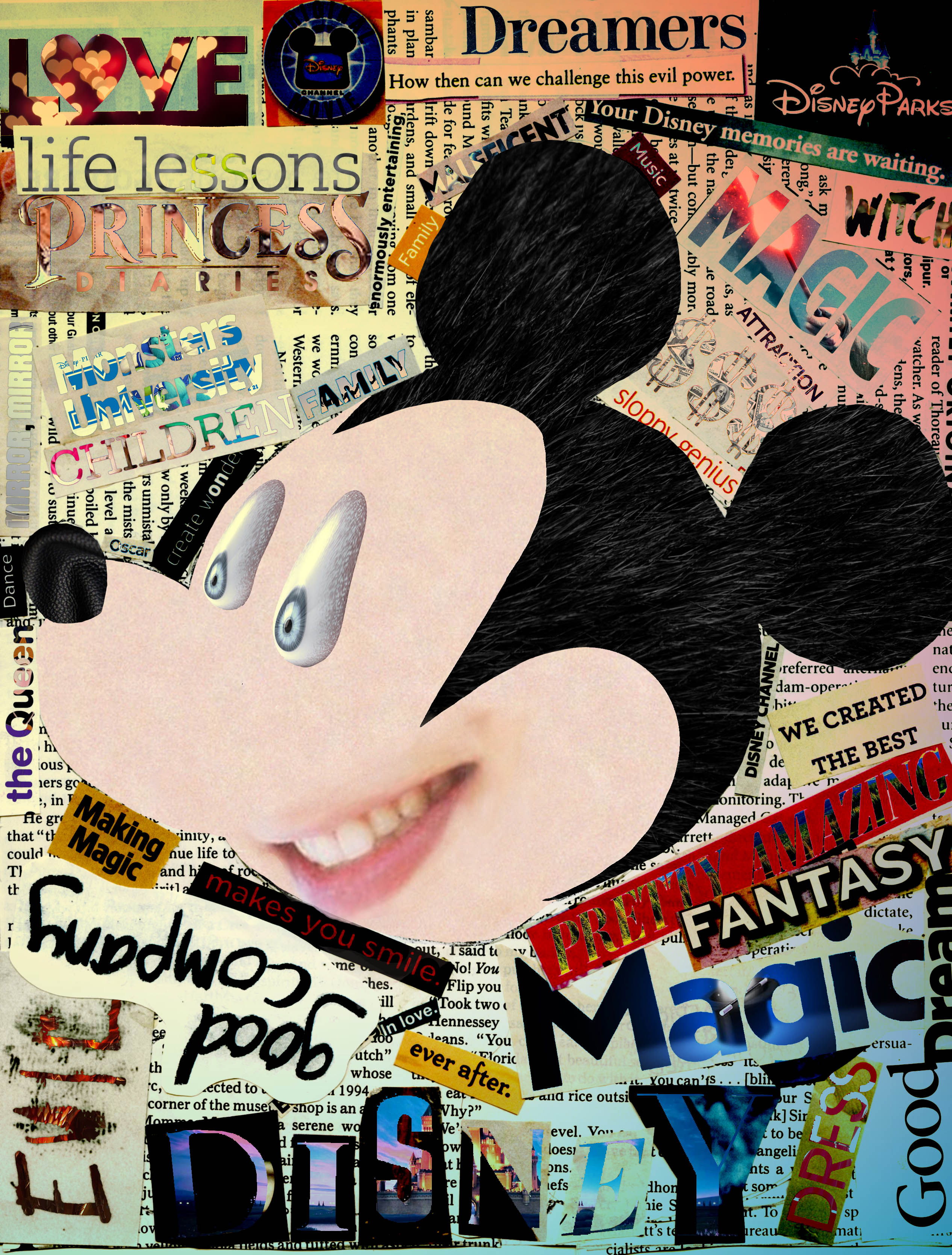
With my group's theme being Disney, with the image comprised of words that described the company, it was interesting to see that although each group member started with the same image, each member created a set of images completely different and unique compared to the other members. Here was my approach:

As I applied the realistic theme to the original image, I decided to make a literal creation of that, replacing images and text with what they literally are. The most prominent ones are replacing Mickey's mouth with an actual mouth, Mickey's skin with real skin, his eyes with warped human eyeballs, etc. When looked at within the complete work, this image is purposefully put in the middle. When you look at the text surrounding the central image, everything feels natural, but the slight unease presented by the central image is hinting that there's something wrong. Compared to the other two images, the impact this image leaves isn't on the sides of extreme or subtle, instead taking a position in the center-left.

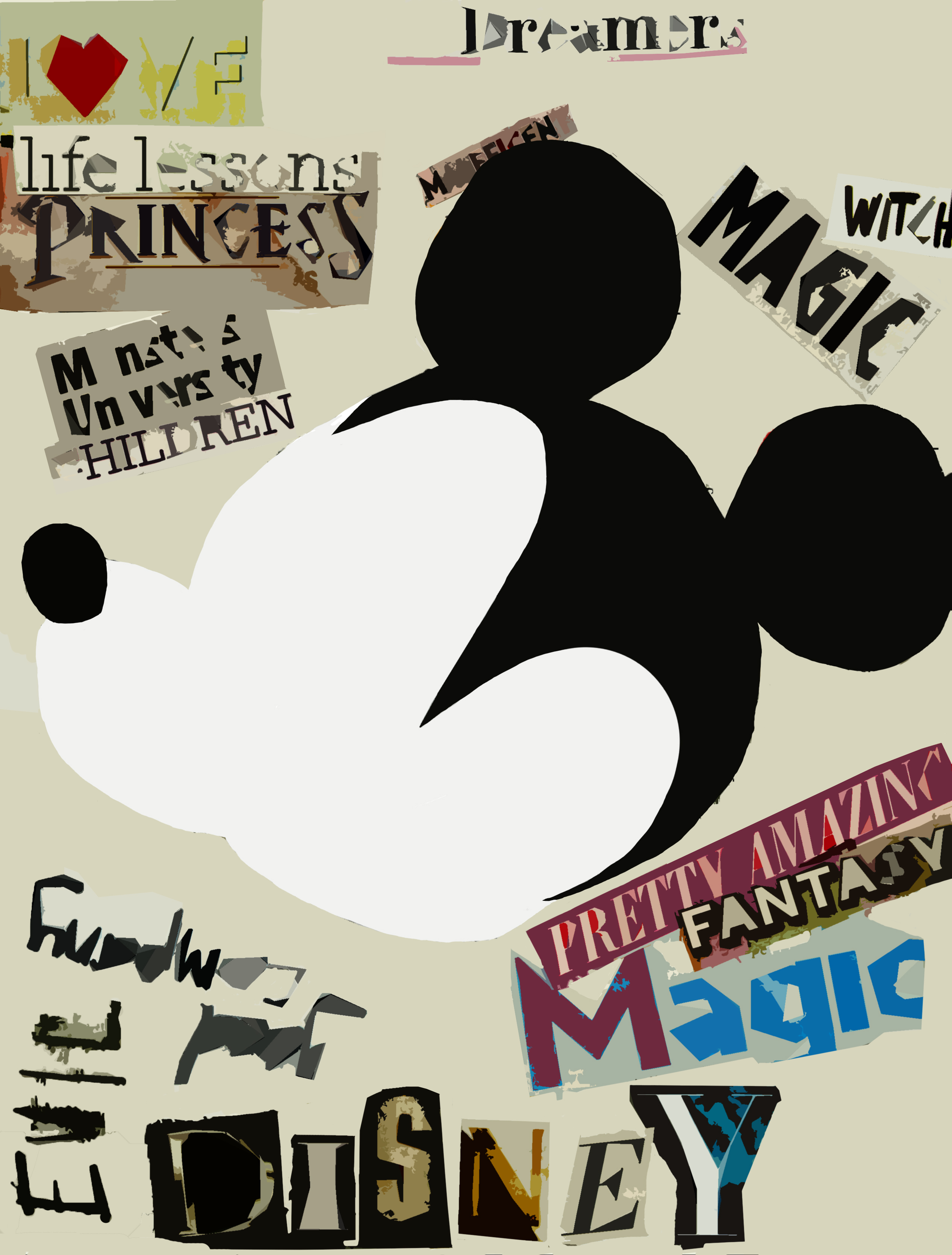
Compared to the other two images in the work, this image is certain the most dull, perhaps due to the simplistic look. However, if I were truly aiming for a simplistic look, would I have kept the surrounding text? The purpose served by the text is to connect to words that we associate with Disney, or the image that Disney is trying to uphold. They want us to see them simply as a company that does good things, however, is this simplification justified for a company that's building a larger and larger monopoly on the entertainment business?

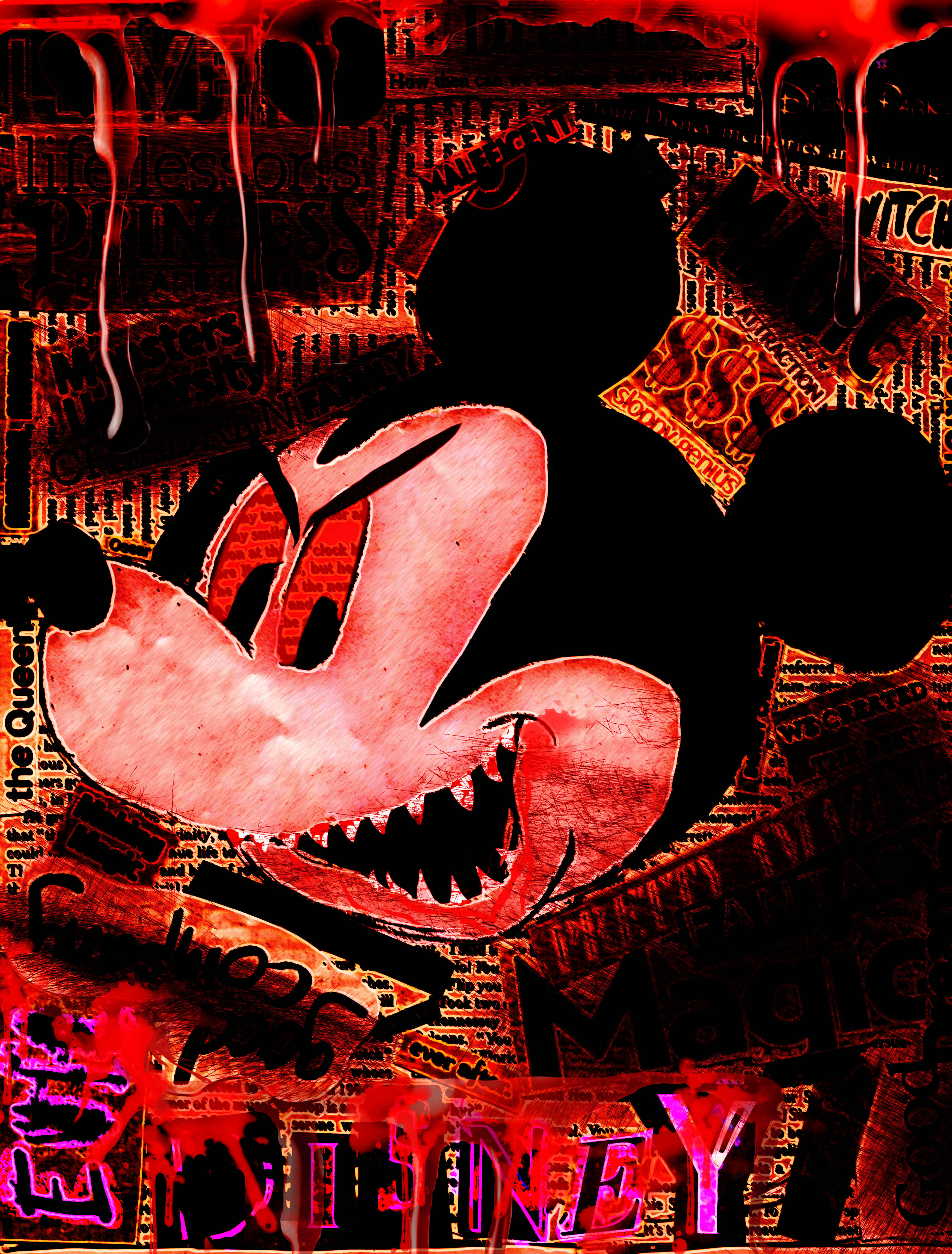
Perhaps the most striking of the three, this image clearly portrays an extreme corrupt version of Disney through manipulation of the central image and the use of red, black, and blood. You'll quickly realize that many of the words have been almost burnt out of the image, with only a select few left; evil, witch, Maleficent, $$$, Monsters, the Queen, ever after, we created, and life lessons. Additionally, two words can bee seen highlighted in pink: Evil Disney. Now isn't that intriguing.
In fact, it was intriguing enough for one of my group members to invite me join my school's student council as their graphic designer. The group member happened to be a younger sister of the design committee exec for student council that year, and since the previous graphic designer had graduated the year before, they were looking for a new graphic designer to take up the role. I always toyed with the idea of being a leader, but never committed to actually taking a leadership role within my community. Mind you, I was still a timid introvert. However, this was an opportunity I knew I had to take, even if it pushed me way out of my comfort zone. As you'll see in the following posts, this single decision would go on to define the rest of my high school career, and ultimately reshaped me into the person I am today.
