While I'm heavily passionate about graphic design, in my grade 12 year, I would be introduced to a new medium to expand my passion in the form of 3D. Learning about Blender in my DMD 12 class, and additionally Unity in my 3D Game Development class, I was able to create several 3D works, surprising myself with how simple and time efficient 3D modeling was compared to some graphic design and After Effects work I had previously done. And the fact that a free and relatively simple program to learn, Blender, could create decently realistic renders on the fly blew me away. Here are examples of my work:
A Quick Practice Assignment: Recreate a Logo
Makes use of Blender's ability to have glowing light
Recreate My Teacher's Gumball Dispenser
Makes use of Blender's glass and reflection capabilities
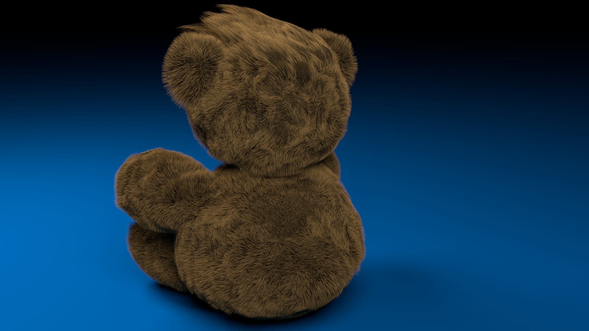
Create A Teddy Bear
Makes use of Blender's ability to create realistic hair
Create an Outdoor Environment
Made use of Blender's ability to create detailed models, such as waves and rocks
Create An Indoor Environment
A recreation of my DMD and 3D Game Design classroom, a room that has heavily influenced who I've become and completely shaped my high school career
A common theme in my Digital Media Development classes was that after we've created so many pieces, where were we going to put them? Thus, after examining several examples of what made a site good and bad, we were taught web design, starting with simple HTML and Adobe Dreamweaver, with my first site being based off Akagami no Shirayuki-hime (Snow White with the Red Hair), an anime that has a fairy tale theme surrounding it:
Homepage
Example of a Webpage
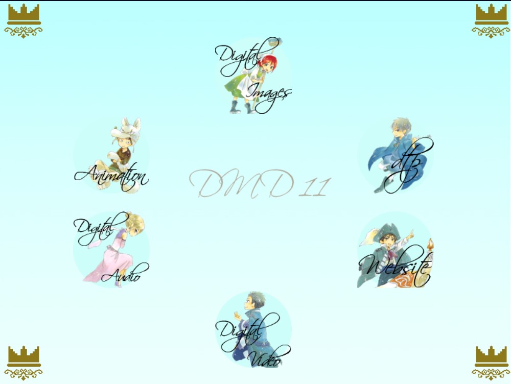
Next was the website for the previously mentioned DMD 11 final project, a made up film festival event. Also created using HTML, one of my group partners were primarily in charge of making this site, with my contribution being the animated buttons seen on the left side. Created in After Effects, these buttons became a nightmare to implement on a HTML site, since buttons usually are made up of images, not videos or gifs. However, by some miracle, after hours of tinkering with code the buttons finally worked:
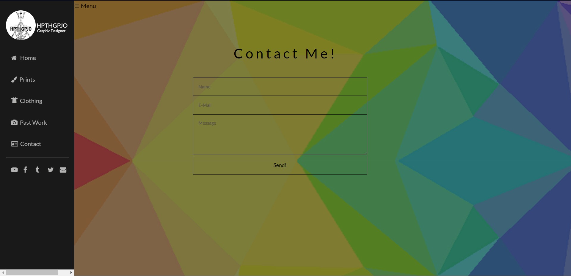
As a final project for DMD 12, we were tasked to make our own custom site using CSS and HTML this time, although we were allowed to implement HTML templates. Thus, my site was a combination templates Prologue and Parallelism, however, using templates doesn't equate to a quick process. Because I was bashing two templates together, I had to pick apart and piece together code that wasn't supposed to work together to form a workable website, and this process took 3 months of trail and error until the site would eventually reach full functionality. The biggest problem was that Prologue's slide out menu just didn't work with Parallelism's code, causing me to have to completely strip the menu out of Prologue's template and re-code it from the basis up. It truly was a long and tedious process, but I'm very proud of the final work: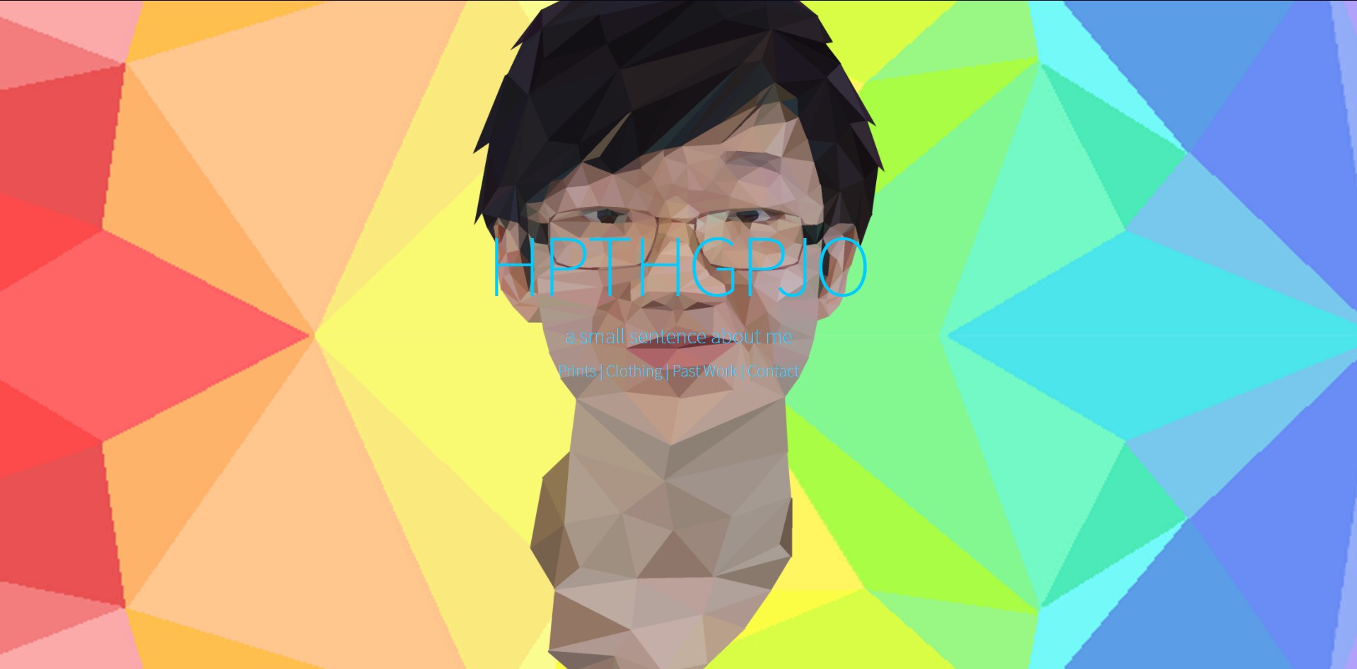
Home Page. Looks awfully familiar...
A Nightmare Inducing Menu Bar
A Quick Tour of the Site
After seeing the above site and being on the site your currently on, you may be wondering "Why hpthgpjo? What does it mean?" Well the short answer to that is that the logo itself is a mashup of three of my favorite literature franchises that had shaped my life before I met graphic design; Harry Potter, with the Deathly Hallows logo, which in itself is made up of three different components, The Hunger Games, with it's mockingjay pin, and Percy Jackson and the Olympians, with Poseidon's trident. Thus, hpthgpjo is an unpronounceable and hard to remember acronym for the names of those series. As you'll see in Chapter 8, I've revolved my online persona around this logo, opening my YouTube videos with an intro created in After Effects:
Alike the Deathly Hallows, the logo is made up of the three series I love the most, and the logos of those series are made up of many other logos from franchises and series that I love. Interestingly enough, after learning graphic design in grade 9, I made this, almost as if it was a farewell to my old bookworm life as I discovered new passions. So while as unpronounceable as hpthgpjo is (hip the gup joe???), it's certainly a name I won't be parting with any time soon.
