We begin our journey in the year 2013, where a grade 9 version of myself would take the first steps towards a life-defining art form simply by taking a class: Graphics Design 9. At this point in my life, I had only briefly taught myself how to use Adobe Photoshop in the most basic, jankiest way possible, so after learning Photoshop in a more traditional way and receiving my first class assignment, to transform an image of oneself into an opposite personality, I found myself wanting to use this assignment as a means to explore the infinite possibilities that Photoshop allows. The result was this:
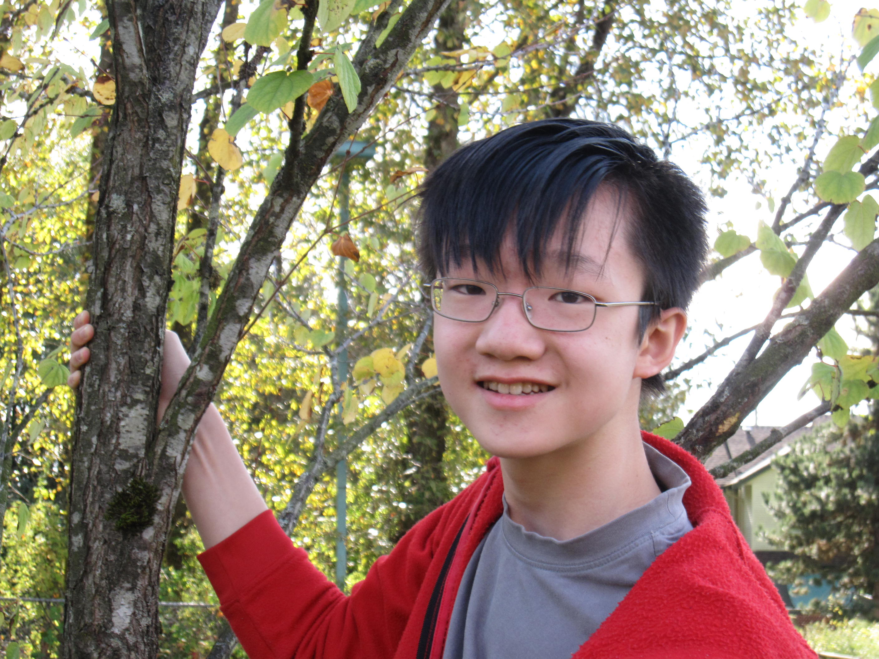

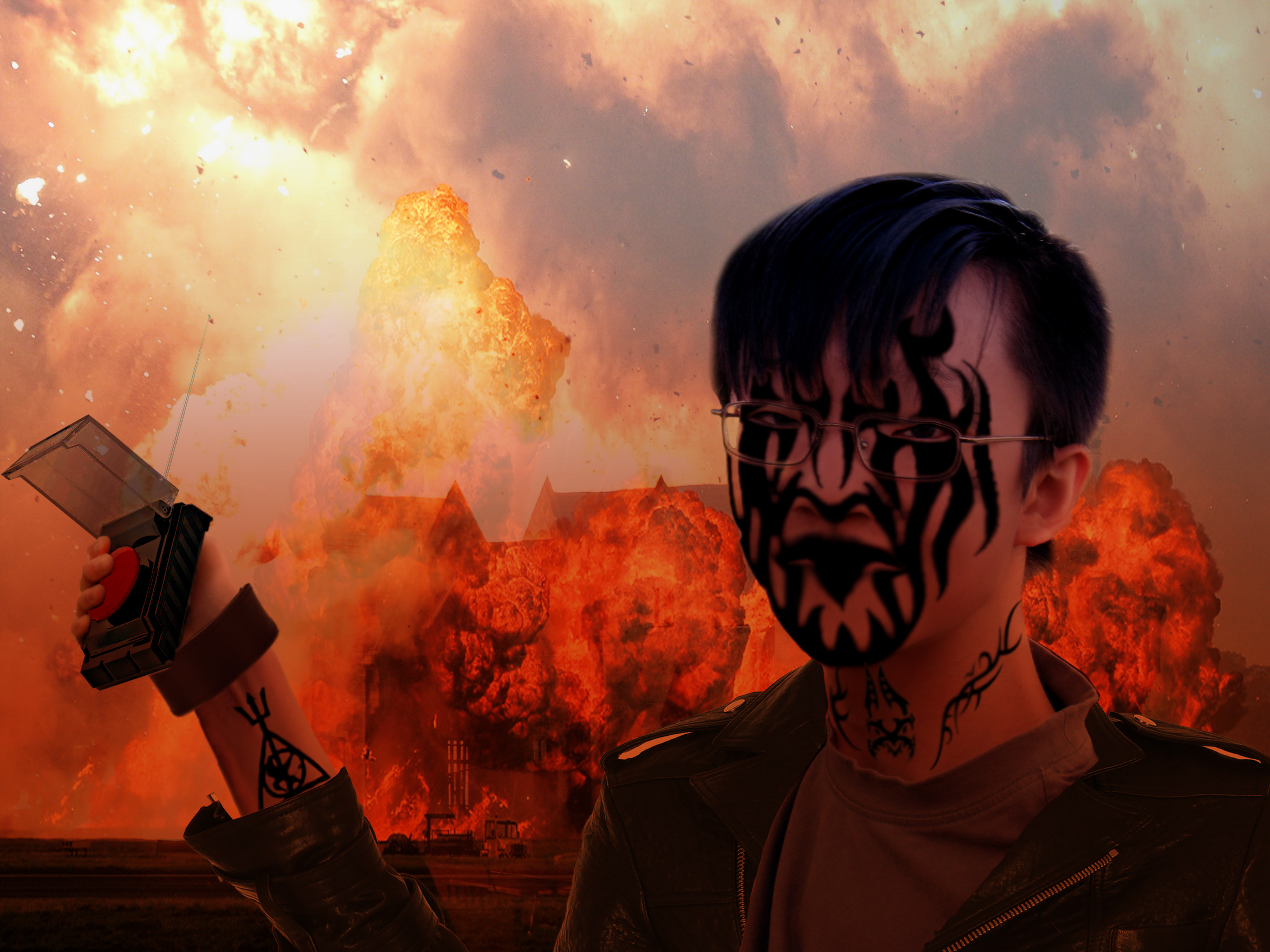
Right click -> Open Image in New Tab to see a larger version of each image
With only a week or two of Graphic Design classes under my belt, I could already accomplish this. Although it is cringey to look back on today, I was extremely ecstatic at the time. Not only was I able to make a work that was visually and technically impressive with the amount of experience I had, the well written prompt for the work provided by my teacher allowed me to create a work with actual meaning. I'm a timid introvert, so when asked to create a visual opposite of that personality type, the first thing I thought of was the rock band "Kiss," with their extreme personalities and striking makeup. Thus, I translated their iconography into the form of tattoos and a leather jacket. However, with a bright green backdrop of trees, the image wasn't complete. To push the idea of "extreme," I took several pictures of explosions and fire, as well as changing the overall lighting of the picture to a red hue, in order to transform this bookworm teenager into what is essentially a terrorist. My peers were both shocked and intrigued when they saw this work, wondering how I could fathom this image in my head. I took that as a sign that my work was successful in what it was trying to do, and my pride gained from that success pushed me to continue making work of this quality.
By this time of the year, Halloween was coming up, and our class was assigned to Photoshop ourselves into some scary creature. On the surface level, this project wasn't anything meaningful; it was just a fun Halloween festivity. However, I learned two valuable lessons from this project: the power of online tutorials and how to deal with failure. Still one of my favorite Photoshop works, I took bits and pieces from various Photoshop tutorials relating to zombifying oneself and created this:
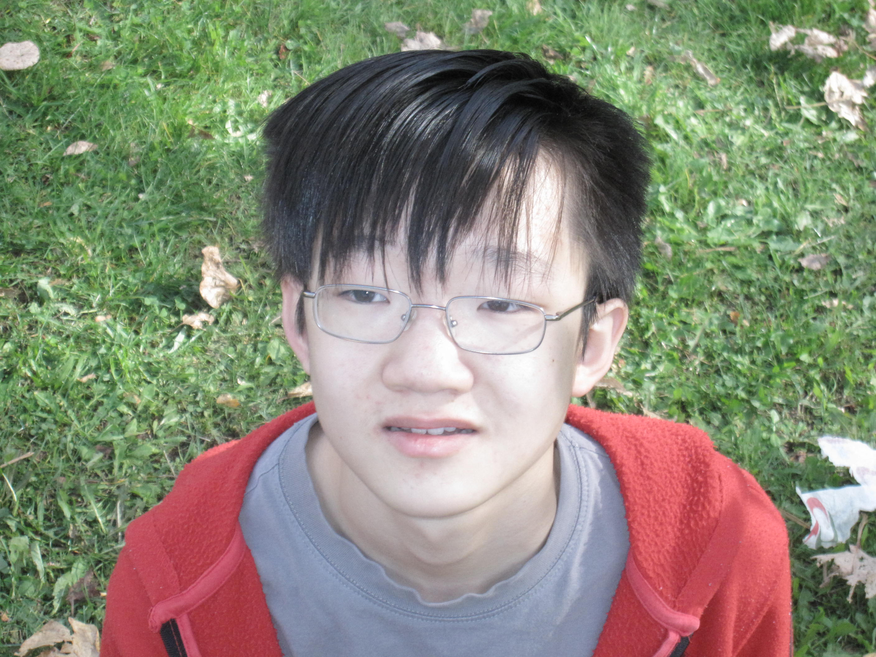

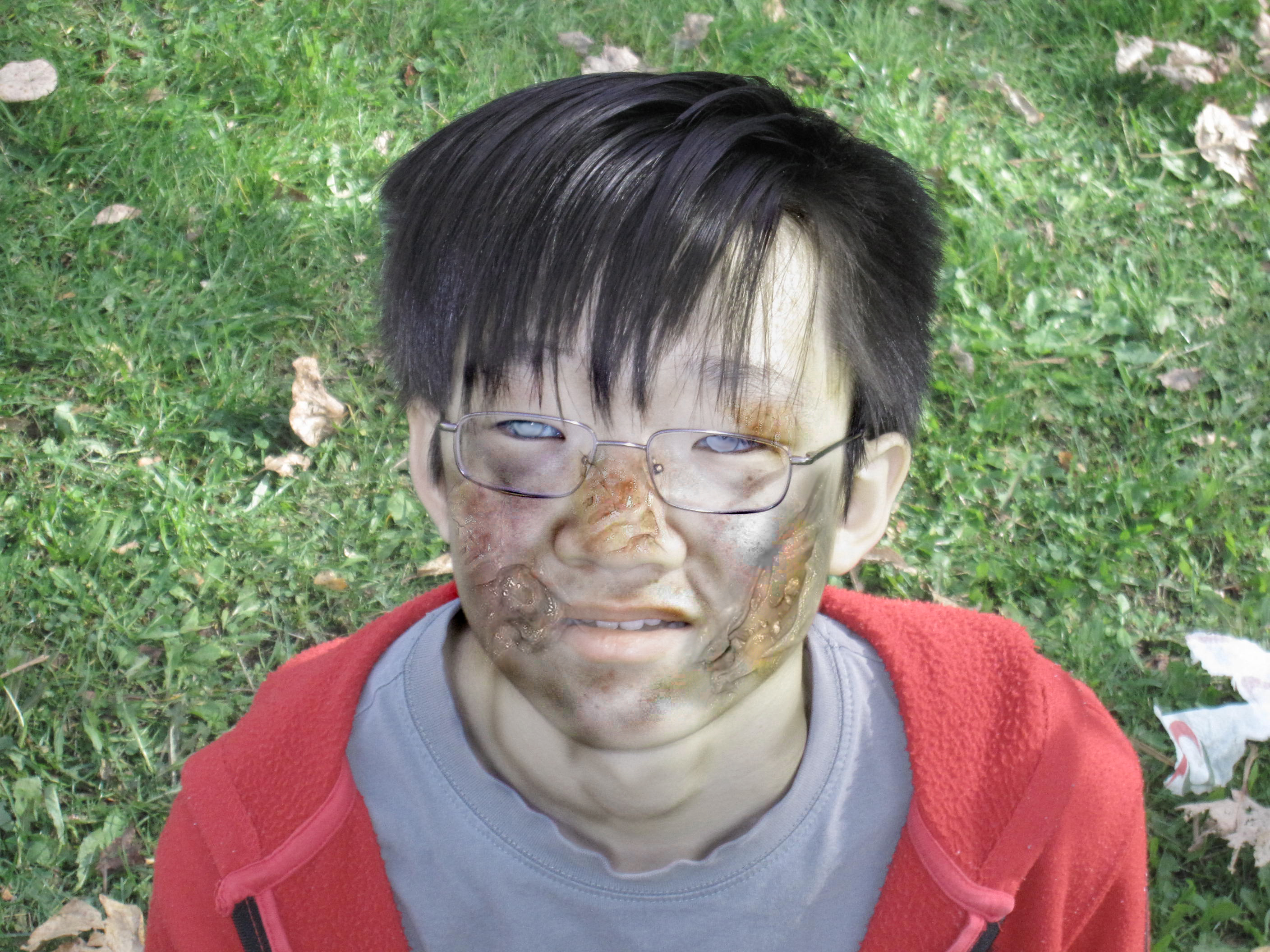
Once again, I was ecstatic with how the work came out just by following several simple tutorials. Now equipped with a brain full of new Photoshop knowledge, I wanted to put that knowledge to the test right away. Using the same picture I used to create the tattooed terrorist above, I proceeded to make myself into wraith/ghost.
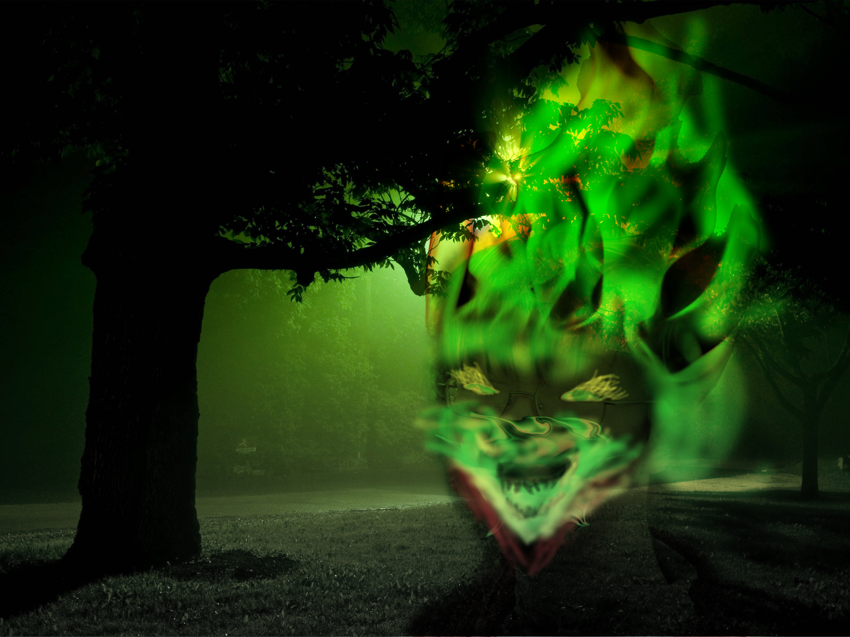
Um. What happened there. While it sure got a good laugh out of my friends and I, this work kept my pride in check. It made me recognize that I wasn't born as some Photoshop genius at birth. I still have a long way to go and a lot of material to learn and master. While making my own work is ideal, using an online tutorial or two doesn't hurt. Thus, I've used online tutorials to assist my future works ever since, eventually developing my own style through these tutorials.
However, one does not recover from failure easily. I wanted the success I had with my previous works again, but with a lack of new ideas, I begin to rely on revolving my work around a single element. One that creates an easy reaction, is visually appealing, and is easy to create: explosions.
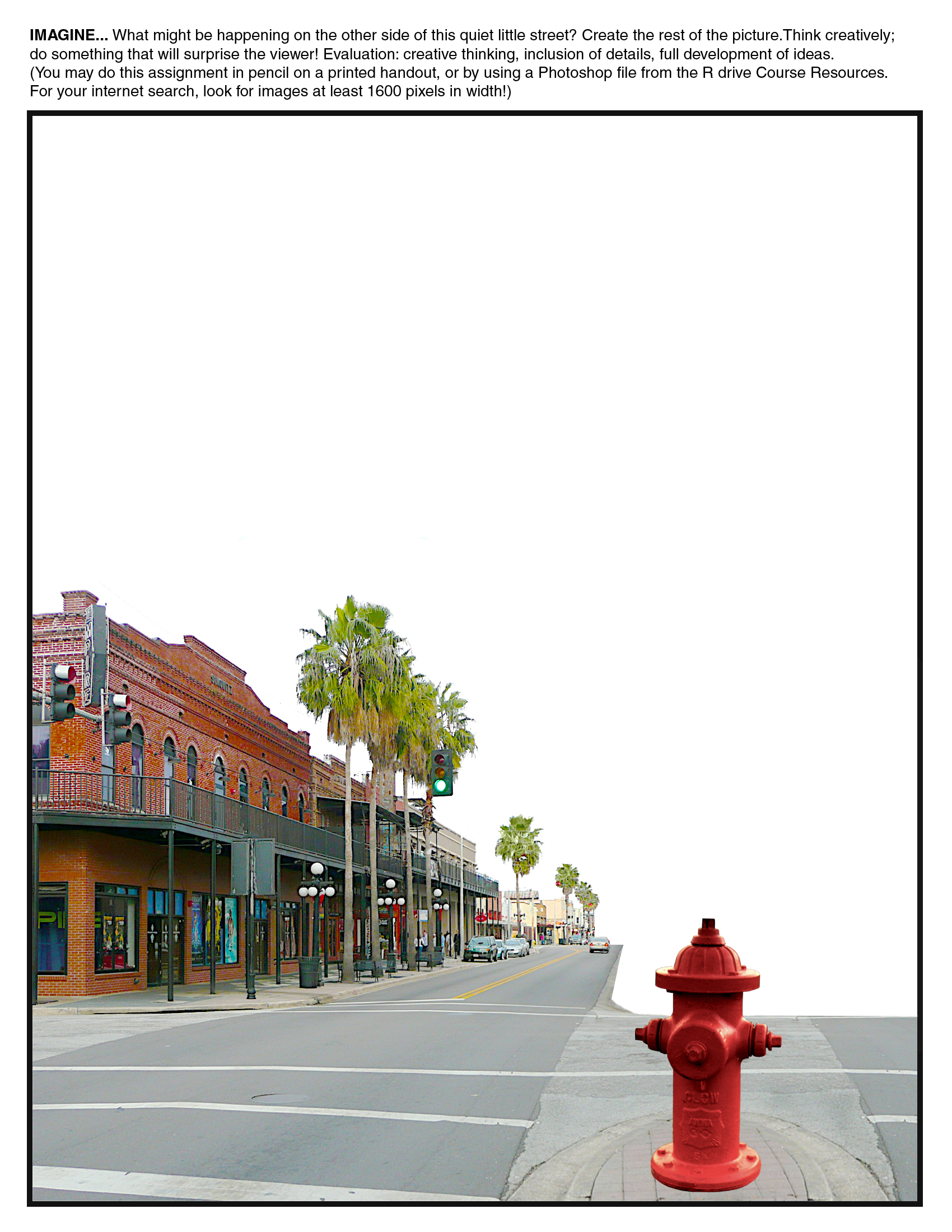

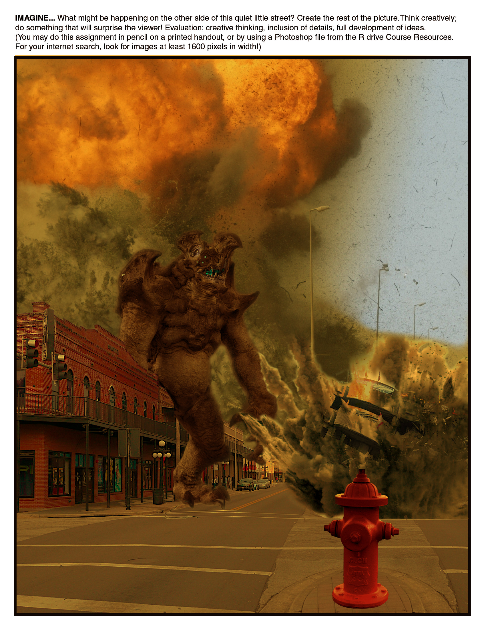


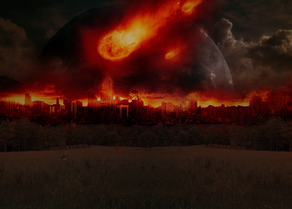
One asked to creatively add elements to the street scene as to surprise the viewer, and the other asked to create a image related to a given short story. The works didn't turn out visually horrible. But the process of making these two works felt exactly the same, and that's when I realized that in the process of trying to find success, I had trapped myself in a loop of making nothing new. Not because I was using explosions; having similar elements across several different works is perfectly fine. The problem was that I didn't learn much from creating either of these works. And that scared me.
Within the next year, this event would put me on a path of self-discovery within digital art forms. I would begin to explore different mediums as well, from video to animation to music. However, before the year ended, I was tasked to make one final work for my Graphics 9 class.
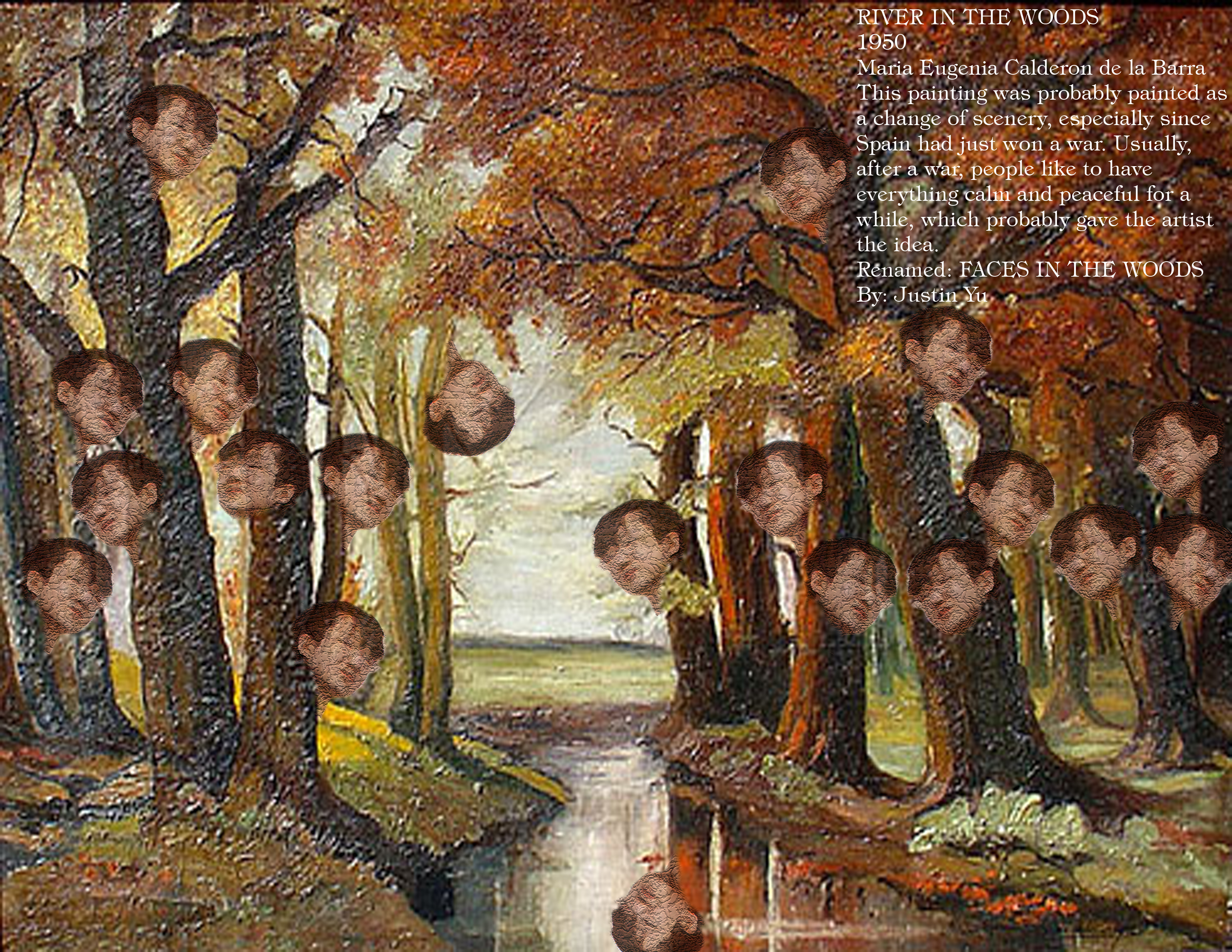
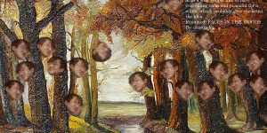
RIVER IN THE WOODS
1950
Maria Eugenia Calderon de la Barra
This painting was probably painted as a change of scenery, especially since Spain had just won a war. Usually, after a war, people like to have everything calm and peaceful for a while, which probably gave the artist the idea.
Renamed: FACES IN THE WOODS
By: Justin Yu
To be perfectly honest, the meaning and purpose of this work have completely escaped my memory. Is it supposed to mean that we're always being watched? Perhaps it means that we're all born from the same roots; replications of the same personality disguised under different faces. Or maybe it's just a funny image. Interpret this as you may, it's unique. It's risky. And it showed that I had put myself back on the path of creativity.
