In my grade 12 year, I would continue to creating various posters advertising events, except this year I had the opportunity to create posters that were not exclusive to student council events. The first of these was an DMD 12 assignment, where we were asked to create a poster for our school district’s upcoming film festival, of which my DMD 12 teacher organizes, with a committee picking out one of ours to use as actual advertising. There were several elements we had to include in our poster, comprised of the logos of the participating schools as well as the logo of the film festival and the time and place it would take place. However, when looking at the posters from previous years, I saw a lot of the same elements being used, and noticed that the posters weren’t something that would catch your eye and interest you in this event.
The previous year's posters are not available online, but can be just made out in this picture
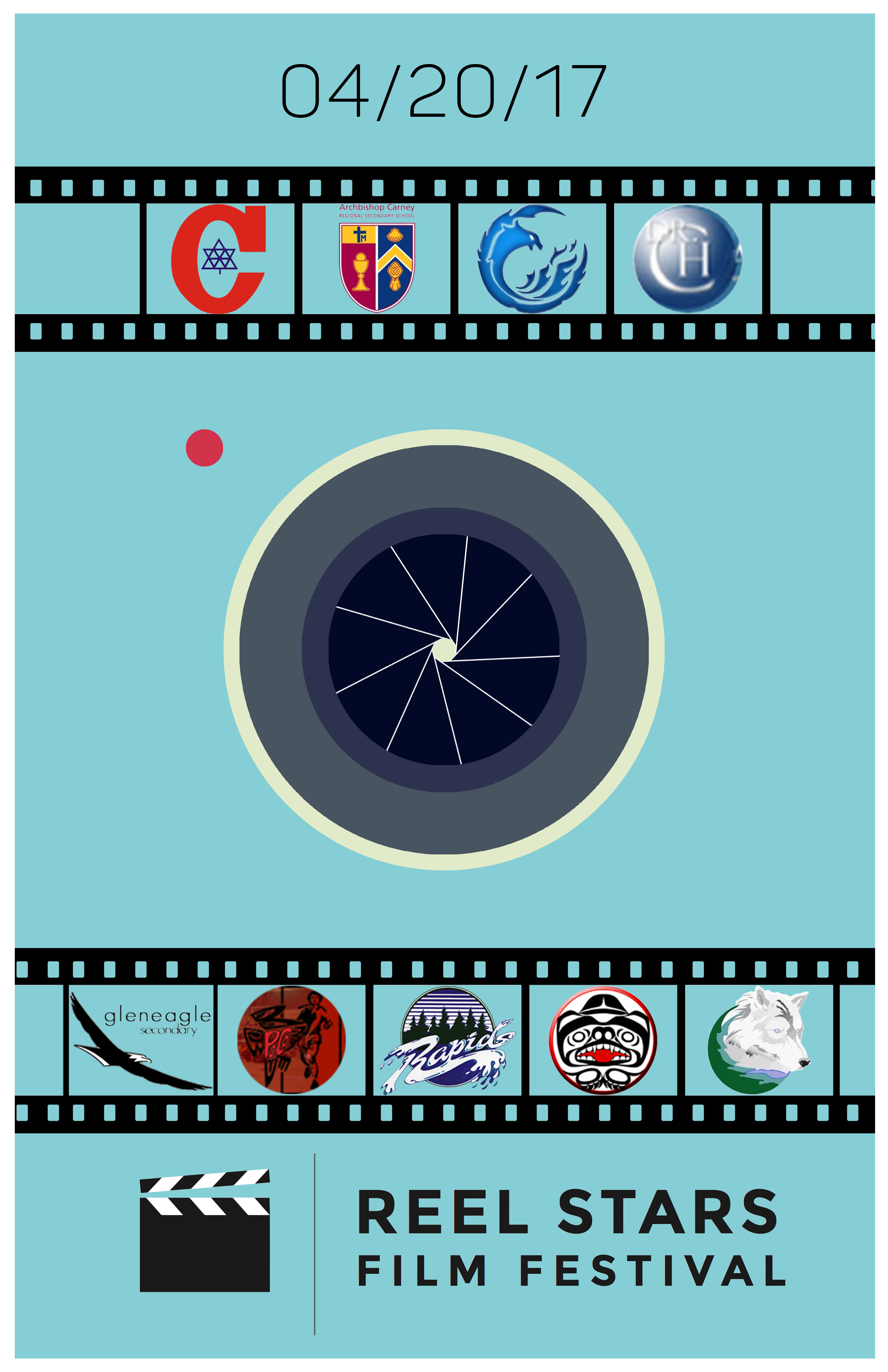
So while keeping the required elements, I disregarded the previous posters as sources of inspiration and made a poster completely of my own, again making us of the minimalist style that I had been practicing.
I ended up only spending less than half an hour on the poster and felt disappointed with the work, most likely because I was still comparing myself to the previous posters, as well as the posters my peers created, which made use of numerous complicated visual elements, while my own poster was relatively simple. However, I was currently in the long process of coding my own website as a final project for DMD 12 and didn’t have much more time to worry about this poster. Much to my surprise, the film festival advertising committee actually really liked my poster, deciding to use it as their main promotional material for the year.
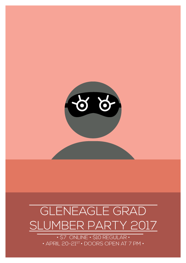
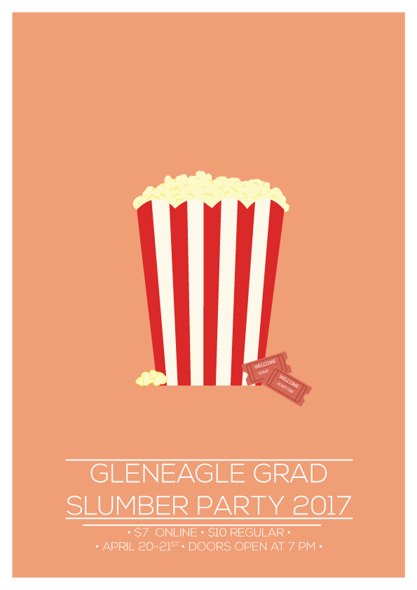
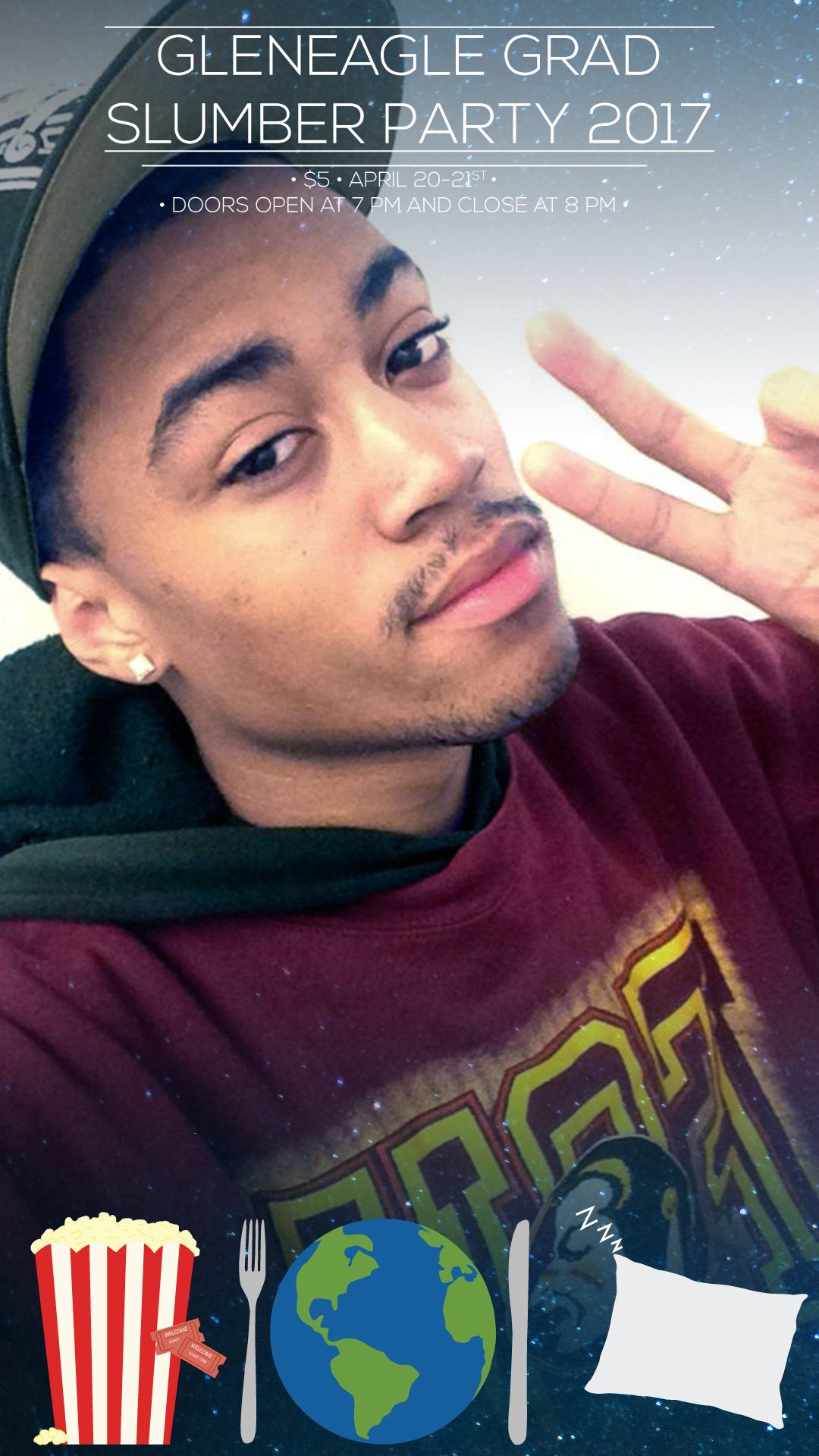
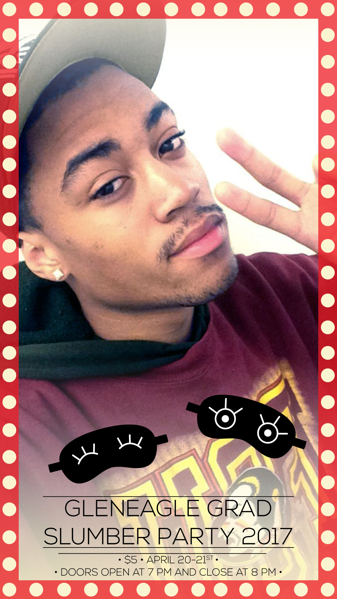
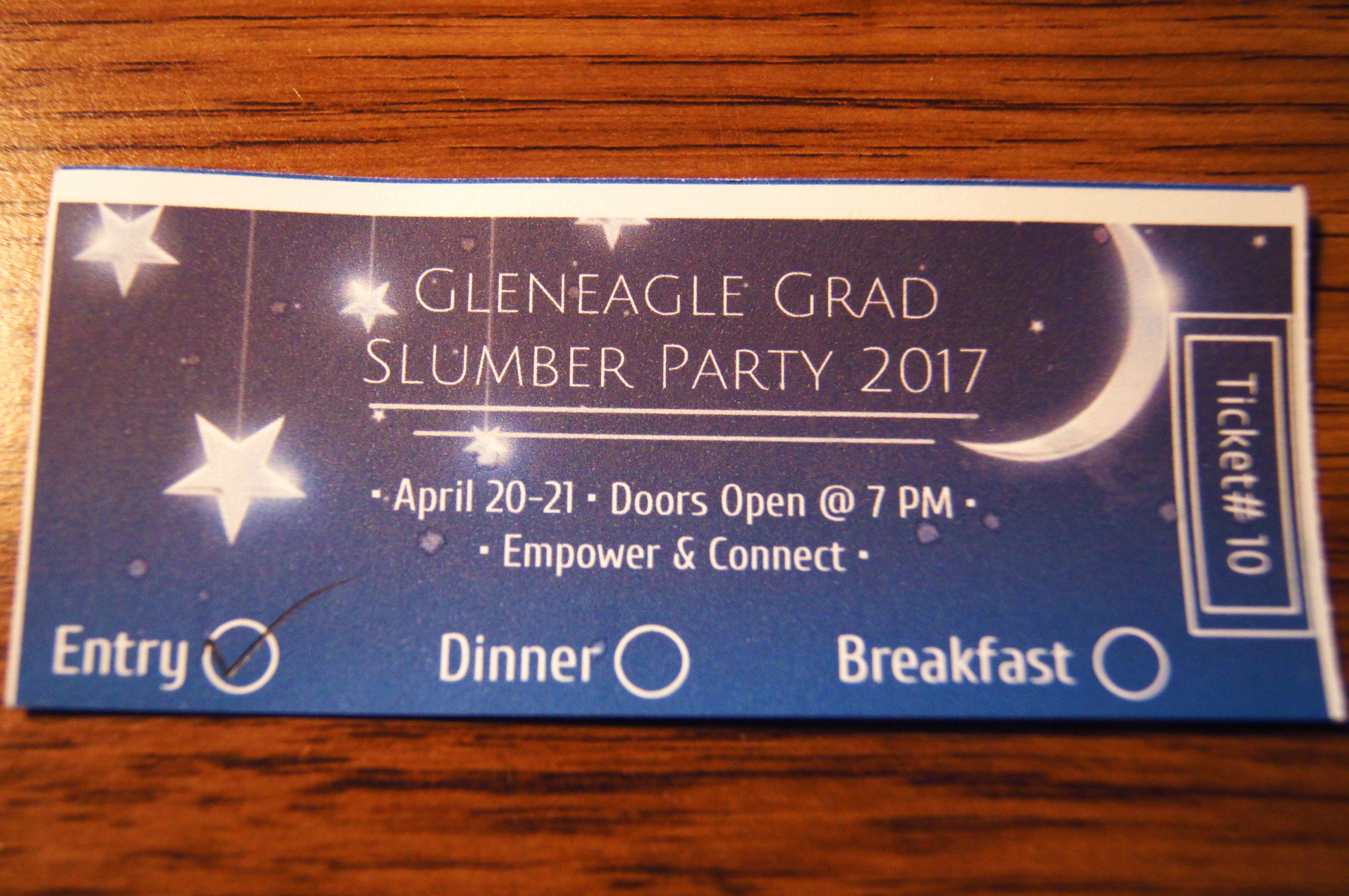
My next widely featured work was for a group in a Leadership 12 class that was planning a grad slumber party and needed advertising material to advertise their event. Since some of the group member knew about my work from working with me in Student Council, they asked if I would be willing to help them with creating advertising material in my free time, and of course, I happily accepted. This was an especially fun project to work on since it would require me to make pieces for three different mediums: advertisement posters, Snapchat filters, and physical tickets. Two of these were new to me, and I am additionally not a frequent user of Snapchat, which made it challenging but fairly fun to think creatively as of how a Snapchat filter for a slumber party would look like. Playing around with minimalist and low poly styles within Adobe Illustrator, this is what I eventually came up with:
It worked out well, and the group that commissioned the work was really pleased with the result. However, lack of communication strikes again. Since the group didn’t throughly communicate with the people who would print out the tickets before hand, they realized that the afterwards that the ticket designs I had made would use a lot of toner, thus it would be pretty expensive to print. Mainly working digitally, this was a problem that never crossed my mind. The tickets were quickly redesigned by a teacher to be more printer friendly, and while they didn’t look as pretty, at least they were able to serve their purpose as tickets.

